Designing the Perfect Footer: Tips to Enhance User Experience from the Ground Up
When it comes to designing a website, the footer is often an afterthought, with most of the focus placed on the header and main content areas. However, this small but significant section of your website plays a crucial role in enhancing user experience (UX). A well-designed footer can help guide visitors, reinforce your brand, and provide essential information.
Understanding the Role of the Website Footer
What is a Website Footer?
The footer is the section located at the bottom of your website, appearing on every page. Traditionally, footers were used to display copyright information and perhaps a link or two. Today, they have evolved to become a key component of UX, offering users easy access to important information and additional navigation options.
Why Footers Matter for UX
The footer is often the last thing a visitor sees before leaving your website. It serves as a final opportunity to guide them to other parts of your site, provide contact information, or encourage them to take action. A well-structured footer can improve navigation, enhance trust, and ensure that users leave your site with all the information they need.
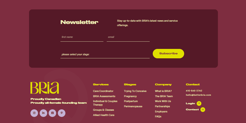
Common Elements in a Footer
Footers typically include a variety of elements, such as:
Contact information (phone number, email, address)
Social media links
Copyright and legal disclaimers
Navigation links (About Us, Privacy Policy, Terms of Service)
Call to Action (newsletter sign-up, special offers)
Site map or secondary navigation
Key Elements to Include for a UX-Optimized Footer
Are Your Navigation Links Easy to Find?
Ensure your footer includes essential navigation links that help users quickly find what they need. Links to the About Us page, Contact page, Privacy Policy, and other critical sections should be easily accessible. This not only improves UX but also boosts SEO by making important pages more discoverable.
Can Users Contact You Easily?
Your footer should make it easy for visitors to contact you. Include a phone number, email address, and physical address if applicable. This information builds trust and makes it clear how users can reach out if they have questions or need support.
How Well Are You Integrating Social Media?
Integrating social media links into your footer allows users to connect with your brand across multiple platforms. Ensure these links are clearly visible and lead directly to your active social media pages. This encourages ongoing engagement and helps build a community around your brand.
Is Your Call to Action Effective?
Don’t overlook the power of a well-placed CTA in your footer. Whether it’s encouraging users to sign up for a newsletter, download a resource, or take advantage of a special offer, a CTA in the footer can be an effective way to drive conversions.
Are You Covering Legal Bases?
To ensure your website is compliant and trustworthy, include legal information such as disclaimers, privacy policies, and terms of service. This not only protects your business but also reassures users that their privacy and rights are being respected.
Design Best Practices for Footers
1. Keep It Simple and Clean
A cluttered footer can overwhelm users and detract from the overall UX. Keep the design simple and clean, with a focus on the most important elements. Use ample white space and limit the number of links to avoid confusion.
2. Consistent Branding
Your footer should reflect your brand’s identity. Use consistent colors, typography, and logos to reinforce your brand throughout the site, including in the footer. This helps create a cohesive experience that resonates with users.
3. Mobile Responsiveness
With an increasing number of users accessing websites via mobile devices, it’s crucial that your footer is mobile-responsive. Ensure that all elements are easily clickable and that the design adapts well to smaller screens, providing a seamless UX across all devices.
4. Hierarchical Structure
Organize your footer content in a logical hierarchy, with the most important information at the top. This helps guide users to the content they’re most likely to be interested in and makes navigation more intuitive.
Common Footer Mistakes to Avoid
1. Overloading with Links
While it’s tempting to include as many links as possible in your footer, overloading it with too many options can confuse users. Focus on the most important links and group them logically to maintain a clean, user-friendly design.
2. Neglecting Mobile Design
Failing to optimize your footer for mobile devices can frustrate users and lead to a poor UX. Make sure your footer is mobile-friendly, with touch-friendly elements and a layout that adapts well to different screen sizes.
3. Inconsistent Design
Your footer should feel like a natural extension of the rest of your website. Avoid using a design that clashes with the rest of your site’s aesthetics. Consistency in design is key to creating a seamless user experience.
Maximize Your Footer’s Potential
Your website’s footer may be at the bottom of the page, but it plays a top-tier role in enhancing user experience. By including essential elements, following design best practices, and avoiding common mistakes, you can create a footer that not only looks great but also functions effectively. Take the time to review your current footer design and consider implementing the tips shared in this blog to optimize it for a better UX. Remember, a well-crafted footer can leave a lasting impression and keep visitors engaged with your site long after they’ve scrolled to the bottom.
Ready to elevate your website’s UX? Contact Savvy Peach Creative Co. today for expert website design and optimization services!
Not sure where to start? Let the Peach help you every step of the way.
Our dedicated team is here to help you plan and design your website. Schedule a time to speak with us and let us answer your questions to know exactly what you need to get yourself started.


